Animation & Drawing by Do Ink
Table of Contents
Tutorial: Making a Composition
Introduction
An animation is a sequence of images, displayed one after another. Usually, each image in the sequence looks similar to the one that came before it – similar, but not exactly the same. Each image shows the scene at a slightly different point in time. By making small changes from one image to the next, the illusion of motion is created for the viewer.
Here's the catch: to make an animation that looks smooth and natural to the viewer, you need lots of images. To create just one second of animation, you may need up 30 images to create smooth-looking motion. You can reduce that number somewhat – 16 images per second looks pretty good, and even 10 images per second may be acceptable for some animations – but even for fairly short animations, that's a lot of images. Up to 300 images would be needed for just 10 seconds of animation!
Here's the good news: we're not going to ask you to draw 300 pictures in order to create 10 seconds of animation. In fact, you don't need to draw any pictures if you don't want to.
Do Ink Makes It Easy
So, how do you make an animation? One way would be to draw each image in the sequence individually. This can be a painstaking process, but if that's what you want to do, Animation and Drawing by Do Ink lets you do it that way.
But there's a much easier way. Rather than drawing each image in your animation individually, you can take simple elements – a drawing of a character or an object, for example, or a background drawing or a photo – and combine them into an animated scene, with easy instructions for how you want each element to move and behave. The app takes it from there, automatically creating all of the images needed to produce your animation.
Overview of the App
There are three main "work areas" in Animation and Drawing by Do Ink. Two of them are editors where you'll create your animations. You can make a complete animation using either one, but the real power of the app comes when you use them together.
- The Drawing Editor is where you create individual drawings, or animated sequences made up of multiple drawings. In fact, you can use the Drawing Editor to create an entire animation, by creating each image in the sequence, one at a time.
- The Composition Editor is where you combine various elements – characters, objects, text, images, and even photos – into a complete animation. And in the Composition Editor, you don't have to draw a thing!
- The Gallery is the third main area in the app. It's where you manage, organize, and share your animations and drawings.
Getting Started
This may come as a surprise, but we recommend that new users get started right away with the Composition Editor.
Why not the Drawing Editor? After all, most of us have used drawing apps before, and the Drawing Editor lets you create "flip book" frame-by-frame animations, which are also familiar. The problem with starting out in the drawing editor is that, well... you'll have to draw. What's more, if you want to make an animation that's more than a split-second long, you'll need to draw quite a lot.
In contrast, using the Composition Editor, you can make your first animation in just a minute or two. You won't need to draw a thing, and your animation can run for as long as you'd like.
Ready to get started? Take a few minutes to step through the tutorial: Making a Composition, and you'll be animating in no time!
Tutorial: Making a Composition
First Steps
The app starts you off in the Gallery view. After you've made some animations, this is where you'll organize and share them. It's also where you'll come to create a new animation – either a composition or a drawing. We recommend getting started right away using the Composition Editor. Here's how to do it:
If you aren't already in the Gallery view, you need to go back to it by tapping the "Gallery" button in the upper left corner of the screen.
You can move and resize this tutorial view! Drag in the title bar to move the view. Drag the sizing handle in the lower right corner to change its size. You'll probably want to make the view smaller as you're going through the tutorial.
Tap the
 button in the upper right corner of the Gallery view. You'll see a drop-down menu with the options: New Composition and New Drawing.
Select New Composition. The app creates a new composition and opens it for you in the Composition Editor. (This help view should reappear, so you can continue.)
The large area in the middle of the Composition Editor (gray, with a white rectangle in the center) is the "canvas". You can place objects anywhere on the canvas, but only objects inside the white rectangle will appear in your finished animation.
- Now we're going to add a couple of elements to your composition. Tap the
 button in the center of the upper toolbar to open the Chooser.
You can add drawings and compositions that you've made, downloadable "props" from the Do Ink prop library, and photos and images from your camera roll. The app includes a "background" drawing and a "bug" composition to get you started.
- In the Chooser, you should see a couple of clips tagged "tutorial". Tap the "background" clip's thumbnail to add it to your composition.
If you make a mistake, or want to back up a step or two, use the
 undo button!
 - In the Composition Editor, the background drawing should be visible on the main canvas, and on the Timeline at the bottom of the screen. The Timeline is one of the primary tools in the Composition Editor. Scrolling the Timeline left or right controls the playhead position – that is, the point in time displayed on the composition canvas. Try scrolling the timeline back and forth. Notice that once you scroll past the end of the background drawing on the Timeline, it disappears from the canvas. The app automatically sets the start time and duration of a clip when it's added to a composition. We'll talk about how to change these values later in this tutorial. When you're ready to go to the next step, scroll the Timeline back to the beginning (zero seconds).
- Now we'll add an animated character to your composition. Open the Chooser again by tapping the button on the upper toolbar. Tap the "bug" clip to add it to your composition.
Notice that if you scroll the timeline now, the bug's legs, wings, and antennae wiggle, but the bug itself doesn't go anywhere. Scroll the Timeline back to the beginning when you're ready to go to the next step.
Notice that the bug has a blue selection box drawn around it on the composition canvas. We'll use these tools to change the bug's position, size, and orientation. Notice also that there's a green "pathing" handle
 in the center of the box. We'll use that to create a path for the bug to move along.
Now is a good time to familiarize yourself with the composition canvas tools. Remember, you can always tap the
undo button to back up or correct a mistake. Here are a few things you might want to try:Make sure the timeline is positioned at the beginning (zero seconds).
Tap (but don't drag) on the background drawing, making sure not to tap on the blue selection box's corner handles or the green pathing handle in the center of the box. Notice that the background drawing becomes selected – now it appears on the timeline, and the selection box is around it. Tap the bug to select it again. You can select any object on the canvas simply by tapping it.
Drag on the canvas, again making sure not to drag on the selection box's corner handles or on the pathing handle. Notice that the selected clip moves around on the canvas.
Drag any of the blue corner handles on the selection box. The clip will either scale or rotate, depending on the direction you start your drag gesture. If you drag either towards or away from the center of the selection box, you'll start a scale operation. If you drag around the center of the selection box, you'll start a rotate operation.
We'll cover the pathing tool further along in this tutorial.
Drag on the canvas (making sure not to drag on the selection box's corner handles or on the pathing handle). Move the bug over to the right side of the canvas.
Now we're going to use the pathing tool to make the bug move across the canvas. Drag on the pathing handle
, moving towards the left. You'll see that as you move along, the bug moves with you, and a green line appears, showing where you've been. Draw a path over to the left side of the canvas.Now, when you scroll the Timeline, the bug will follow along the path you've drawn. If you're unhappy with the result, tap the
undo button to remove the path, and try again! Tap the  play button on the upper toolbar to see a preview of your animation.
That's it! You've made your first animation with Animation & Drawing by Do Ink.
The Composition Editor
The Composition Editor is where you combine various elements – characters, objects, text, images, and even photos – into a complete animation. You add an element to your composition and then describe how you want that element to behave. You control when the element appears in your animation, where the element is located as it moves across the canvas, and how the element is presented, using the element's scale, rotation, and opacity properties. The Composition Editor lets you build up complex animations by following this simple process: add an element and describe how you want it to behave, then repeat the process until your animation is finished.
To create a new composition, tap the
What Is a Composition?
A composition combines one or more elements into a single animation, with instructions on where the elements are located, and how they behave over time. Elements are placed in layers, with objects in upper layers appearing in front of objects in lower layers. This diagram illustrates the structure of a typical composition:

In this example, there are four elements: a background drawing in the bottom layer, and three animated characters in the upper layers. The time scale at the bottom of the diagram indicates that the background drawing appears at the beginning of the composition (time zero) and is visible for five seconds. The other elements appear later and have shorter durations. Notice that two characters occupy the same layer – that's okay, as long as they don't appear at the same time.
The images below show what the example composition might look like at about the 1-second mark and near the 3-second mark.

Clips, Props, Images, and Text
One of the fundamental ideas behind the app is this: everything you make is reusable. That includes both single-frame and multi-frame drawings you make using the Drawing Editor, and it includes compositions you make with the Composition Editor. We refer to all of the things as "clips", and they're all reusable. That's because you can take anything you make and add it to a new composition, where it can be "remixed" with other elements.
To reiterate: a single-frame drawing made in the Drawing Editor is a clip, a frame-by-frame animation made in the Drawing Editor is a clip, and an animation made in the Composition Editor is a clip. Any clip can be reused by dropping it into a new composition. Using these tools, you can quickly build up an animation from simple elements, and if you want to, you can make very complex animations by nesting compositions inside of other compositions.
Clips – drawings and animations you've made using the app – are just one type of element you can add to your composition. You can also add props from the Do Ink prop library, photos and other images from your Camera Roll or Photo Stream, and text boxes using the Composition Editor's text tool.
The User Interface
There are four primary areas in the Composition Ediitor:

- The Upper Toolbar is where you'll go to add new elements to your composition – clips, props, images, and text. The play button and a few other controls are also located here.
- The Canvas shows the state of your composition at a particular time. This is where you'll set the locations, orientations, and animation paths of the various elements.
- The Lower Toolbar contains a controls for editing the composition and configuring how the composition's elements behave.
- The Timeline serves two purposes. Scrolling the timeline horizontally sets the composition's current "playhead" time. You'll also use the timeline to adjust the start times and durations of elements in your composition.
Adding Elements to the Composition
To add an element, tap one of the four buttons in the center of the upper toolbar:
Tap the button to add a clip to your composition. The clip chooser view opens, showing all of your drawings and compositions. Tap a clip's thumbnail to add the clip to your composition. After you've added a clip, the chooser view closes, and the newly added clip appears on the canvas.
You can use the tools at the top of the clip chooser view to search for a particular clip with tags, or to view only drawings or only compositions.
The app will not permit you to create circular references between compositions. You can't add any compositions that contain the composition you're currently editing. To prevent this, the clip chooser does not show any compositions that aren't eligible.
Tap the  button to add a prop from the Do Ink prop library to your composition. Props are bits of artwork – some animated, some not – that you may freely reuse in your compositions. Use the search bar at the top of the prop chooser view to find props using tags.
Your iPad must be connected to the internet to access the Do Ink prop library.
Tap the  button to add a photo or image. The image chooser view shows your Camera Roll and, if present, your Photo Stream and albums. Tap any of the stacks to expand it (or use a pinch-to-zoom gesture), then tap on any individual image to add it to your composition.
Instead of tapping a clip, prop, or image to add it to your composition, you can touch and hold on the thumbnail until the chooser view disappears, and then drag the element to position it on the canvas.
Tap the  to create a new text box and add it to your composition. The Text Tool is discussed in more detail below.
New elements are added to the topmost layer, so they'll appear in front of other elements already in the composition. They're inserted starting at the current playhead time, and the duration is set to a default value. You'll use the timeline tool to change these values: the current playhead time, an element's start time and duration, and the front-to-back ordering of the elements.
Using the Timeline Tool
The timeline tool serves two purposes: first, to set the current playhead time and view the animation at any point in time, and second, to adjust the start time, duration, and front-to-back ordering of individual elements in the composition. Let's look at the timeline tool in more detail:

- The Time Scale, at the bottom, marks off elapsed time in seconds.
- The Playhead consists of a vertical red "cursor" line with a time label above it. As you scroll the timeline, the composition is rendered on the canvas as it will appear at the elapsed time under the cursor. The playhead label shows the current time in 30ths of a second.
- The Timeline shows the composition's elements, indicating their start times and duration. Normally, only the currently selected element is shown on the timeline. You can also expand the timeline to show all of the composition's elements at the same time.
Setting the Playhead Time
Scroll the timeline horizontally to set the current playhead time. As you do, the canvas is updated to show the composition at the current time.
The playhead time is rounded to the nearest 1⁄30th of a second, as are element start times and durations. This makes it easy to position the composition's elements exactly where you want them on the timeline.
Changing the Start Time and Duration
Each element in the composition is represented by a block of thumbnail images on the timeline, with diamond-shaped handles  at each end. You can adjust the start time and duration of the selected element using a touch, hold, and drag gesture.
To move the selected element on the timeline, touch and hold anywhere in the middle of its thumbnail block (not on the handles). Then drag the block left or right to reposition the element on the timeline. Moving the element in this way changes its start time without affecting its duration.
It's important that you hold for a moment before you start dragging; otherwise, you'll scroll the entire timeline. You only need to hold for a fraction of a second – experiment with it a bit, and you'll soon get a feel for it.
To change the start time, touch and hold on the left-side handle. Then drag the handle to the change the start time. Note that, unlike the move operation, the element's end time doesn't change. The element's duration is adjusted to keep the end time constant.
To change the selected element's end time, touch and hold on the right-side handle, then drag it to the desired time. This operation updates the element's duration without affecting its start time.
The timeline scrolls automatically whenever you drag near the left or right edge of the screen. Dragging closer to the edge makes the timeline scroll faster; further away slows it down. This makes it much easier to move long distances on the timeline. Give it a try!
Expanding the Timeline
Normally, the timeline shows just the currently selected element, but you can expand it to see all of the composition's elements at the same time. To expand the timeline, tap the  button on the lower toolbar; alternatively, you can drag the button upward. To collapse the timeline back to a single layer, tap the button again or drag it downward.
You can perform the same operations on the expanded timeline as when it's in its collapsed state. Setting the playhead time and changing the selected element's start time and duration work just the same. In addition, you can:
- Select any element by tapping its thumbnail block on the timeline. When you select a new element, you'll see the blue selection box on the canvas change.
- Move any element to a different timeline layer, enabling you to change the front-to-back order of the elements. To do this, touch and hold the element's thumbnail block, then drag it. You can move the element both horizontally, changing its start and end times, and vertically, changing it's front-to-back order in the composition.
Using the Canvas Tools
The composition canvas occupies the area between the upper and lower tool bars. You'll use the canvas tools to set each element's location, scale, and rotation, and to describe how the element will move over time. Here's an example of the composition canvas with two elements visible on it:

- The white rectangle in the center of the canvas represents the Composition Frame. This is the portion of the composition that will be visible in the finished animation. When you add an element to your composition, it is placed in the center of the frame by default.
- The blue Selection Box is drawn around the currently selected element.
- You'll use the blue Scale/Rotation Handles at each corner of the selection box to scale (resize) and rotate the selected element.
- You'll use the green Pathing Handle to create a motion path, showing how the element will move over time. Although the pathing handle is shown in the center of the selection box in this example, in practice it may be located anywhere on the canvas.
Selecting an Element
Select an element on the canvas by tapping it. You may need to tap more than once if there are multiple overlapping elements at the same location – each tap selects a different element, enabling you to select the one you want. When you select an element, it is highlighted on the timeline and blue box is drawn around it on the canvas.
You can also select an element by expanding the timeline and tapping the element's thumbnail.
Location: Positioning an Element
Touch and drag anywhere on the canvas to move the selected element to a new location.
You don't need to touch inside the blue selection box, but be careful not to touch down on any of the scale/rotation handles or on the pathing handle.
In order to set an element's location, the timeline must be positioned at the element's start time, or at its end time, or at a keyframe. At all other times, the element's location is determined using the element's start and end locations, and from the (optional) motion path. So, for example, you can make an element move by scrolling the timeline to the element's start time and setting its starting location, then scrolling the timeline to the element's end time and setting its ending location. When you play the animation, the element will follow a straight-line path between the two locations.
Scale and Rotation: Transforming an Element
Touch and drag on any of the four blue scale/rotation handles to resize, mirror, or rotate the selected element. These handles enable you to either scale or rotate the element – but you can't do both at the same time.
- To scale the element, touch any of the handles and drag either directly towards or directly away from the center of the selection box.
- To rotate an element, touch a handle and drag around the center of the selection box (perpendicular to the direction you'd use for scaling).
As when you're setting the location, you can only scale and rotate an element when the timeline is positioned at the element's start time, or at its end time, or at a keyframe.
When you scale an element, you'll see three guide lines (diagonal, horizontal, and vertical) appear on the canvas. Dragging along the diagonal guide line causes the element to scale uniformly, keeping the element's aspect ratio constant. Dragging along the horizontal guide line resizes the element's width without changing its height; likewise, dragging along the vertical guide line resizes the height without changing the width.
You can also use the scale tools to "mirror" the element horizontally or vertically. Drag along the horizontal or vertical guide line to flip the element over.
Motion Paths: Making an Element Move
Touch and drag on the green pathing handle to create a motion path for the selected element. When you play your animation, the element starts at the beginning of the motion path and moves along it until it reaches the end. Here's an example:

When you first place an element on the canvas, its start and end locations are the same (i.e., it doesn't move). In this case, when you create a motion path, you are also setting its end location at the same time; that is, the end location is automatically set to the end of the motion path. This makes it really easy to drop a new element on the canvas and set its motion path and end location in a single step.
Alternatively, you can manually set the element's end location before you create the motion path. In this case, the end location won't change as you draw the motion path. You're simply describing how the element will move from the start location to the predefined end location.
Notice the red Anchor Handle in the illustration above. This handle is located at the end of the motion path and enables you to change the element's anchor point. The anchor point is reference point in the element's coordinate space that travels along the animation path. The only time you'll want to adjust the anchor point is when you set the element's "Rotate Along Path" property (discussed in greater detail below). To move the element's anchor point, touch and drag on the anchor handle. Although you're dragging the red anchor handle, the anchor point itself is determined by the location of the green pathing handle at the start of the motion path.
Editing the Motion Path
Once you've created a motion path, you may find that it needs a bit of adjustment. There are tools for that, but first, it's important to understand how motion paths are defined. Motion paths are made from one or more segments, either straight or curved, joined together at their end points to form a continuous path. The app provides two tools that let you manipulate these segments, enabling you to fine-tune your motion path.
Tap the  button on the lower toolbar to edit a motion path's segments. When you select the path editing tool, each segment along the path is delineated by a series of nodes. Here's an example of a motion path containing four curved segments, and with one of the nodes selected:

In addition to the node handles marking the end points of each path segment, the selected node has two control handles. To edit the motion path, you can:
- Tap any of the node handles along the path to select the node.
- Drag the selected node handle to change its location.
- Drag either of the selected node's control handles to change the shape of the curve.
- Unlock a node by touching with a second finger while dragging a control handle. This lets you manipulate each control handle separately, enabling you to create corners along the path.
- Double-tap a node handle to toggle between a smooth curve and a corner.
- Double-tap a control handle it. You can create straight path segments using this technique.
Tap the  button on the lower toolbar to delete or add nodes along the motion path. Tap an existing node to delete it. Tap between nodes to add a new node to the motion path.
Element Properties: Rotation, Opacity, and Rate
There are a few additional properties that can be set on the selected element beyond the ones we've already discussed. You access these properties by tapping the  button on the lower toolbar. There are three sections in this properties view:
The Rotation properties provide additional control over how the selected element rotates as the animation plays. Normally, if the element's starting rotation (as set using the canvas rotation tool) is different than its end rotation, the app decides automatically whether the element should rotate in a clockwise or a counterclockwise direction. If the default rotation direction isn't what you want, you can specify clockwise or counterclockwise rotation explicitly. When you set the rotation direction this way, you may also specify a number of "extra rotations" to be performed as the animation plays.
Alternatively, you can specify Rotate Along Path for the selected element. This option causes the app to adjust the element's rotation to maintain a constant relationship with the direction of the motion path. This relationship is determined by the element's starting rotation and by the starting direction of the motion path. (If you've set an ending rotation manually using the canvas tools, that value is ignored when "rotate along path" is used.)
When using the "Rotate Along Path" option, you may want to adjust the location of the element's anchor point. The element pivots around this anchor point as it moves along the motion path, so the location of the anchor can make a big difference in how the natural animation looks. To adjust the anchor point, touch and drag on the red handle at the end of the motion path.
The Opacity properties enable you to control the element's transparency. You can set starting and ending values, ranging from 0% (transparent) to 100% (opaque). If the starting and ending values are different, the app smoothly changes the opacity value as the animation plays.
The Rate property lets you control how fast the element's animation runs, if the selected element is animated (i.e., a multi-frame drawing, a composition, or an animated prop). At a rate value of 1, the element's animation runs at normal speed. Greater than 1, the element animates faster than normal, and less than 1, it animates slower than normal. For example, setting the rate to 2 would cause the element's animation to run at twice the normal speed, and setting it to 0.5 would cause to run at half-speed. Setting the rate to 0 "freezes" the element, preventing its animation from running at all.
Here's another example of how the rate property can be used. Suppose you have a drawing sequence containing 30 frames of animation, designed to run at 15 frames per second. At its normal rate, this animation takes 2 seconds to run. If you add this drawing sequence to a composition, it will initially occupy 2 seconds on the timeline, and it will run at its normal speed. Now, what happens if you use the timeline tool to extend the element's duration to 10 seconds? By default, since the element's natural length is 2 seconds, the app will run through the drawing sequence, then repeat it an additional 4 times (for a total of 5 cycles) in order to comply with the element's 10-second duration. But what if you want the drawing sequence to run only once? That's easily done: just set the rate value to 0.2 (the 2-second natural duration divided by the 10-second desired duration). Now the animation will run in slow motion, and play only once.
Keyframes
Keyframes provide a way to set an element's properties at intermediate times between its start and end times, and to create more complex motion paths and effects.
Suppose, for example, that you've just added a new element to your composition. If you scroll the timeline to an intermediate time between the element's start and end times, you'll find that the app won't let you adjust the element's location, scale, rotation, or opacity – those properties are determined automatically using the start and end values. Now, if you add a keyframe at the intermediate time, you'll find that you can set the element's properties, and that the motion path has been divided into two sections that you can edit independently.
To add a keyframe, scroll the timeline to the desired time, then tap the  button on the lower toolbar. To delete a keyframe, scroll the timeline to the keyframe, then tap the
  button.
When you add a keyframe, you'll see a new diamond-shaped handle appear on the timeline, marking the keyframe's location. You can touch, hold, and drag on the handle to change the keyframe's time within the element (just as you would to change the element's start time or duration). When the timeline is positioned on a keyframe, you'll be able to change the selected element's properties using the canvas tools: location, scale, and rotation. Keyframes divide the element into multiple sections along the timeline, and you can set different motion paths, anchor locations, rotation styles, opacity, and animation rates for each section.
There's a lot of power and versatility in the keyframes tool (and a lot of complexity, too). Keyframes enable you to create complex animation effects using a single composition element. Experiment with them to see what you can accomplish!
The Text Tool
Tap the button on the upper toolbar to add a new text box to your composition. The text tool is illustrated below:

Enter your text in the editor on the left side of the panel, then use the controls on the right to configure the text style and color. The Text Style properties let you specify the font name, style, and size, along with the horizontal alignment and wrapping mode. The Text Color property sets the color of the text itself, while the Fill Color property determines the (optional) fill color of the text box.
The app doesn't support rich text editing, so all of the text in the text box will use the same font style and color.
When you're finished editing and configuring your text box, tap anywhere outside the panel to close the text tool. Text boxes behave like any other element on the composition canvas. You can move, scale, and rotate them, create motion paths, and specify the rotation style and opacity properties, exactly as you would for any other element. In addition, you'll notice that the blue selection box around a text element has four extra handles located at the center of each side (or two handles if text wrapping is disabled). Use these handles to adjust the size of the text box without changing the size of the text itself.

To edit an existing text box, tap the "Edit" button on the lower toolbar. (This button is only visible when a text box is selected.)
Copying, Arranging, and Deleting Elements
Tap the  button to open the selected element tool palette. These tools perform a variety of operations on the selected element:
 cuts the selected element to the pasteboard.
 copies the selected element to the pasteboard.
 pastes an element from the pasteboard onto the canvas.
 duplicates the selected element.
 deletes the selected element.
 brings the selected element to the front.
 brings the selected element one step toward the front.
 sends the selected element one step toward the back.
 sends the selected element to the back.
 resets the selected element to its original state.
 resets the selected element's path.
Tap the
Editor Navigation Tools
If the currently selected element in your composition is editable, you can open the editor for that element directly, without first going back to the Gallery. To edit the currently selected element, tap the "Edit" button on the lower toolbar.
Images from the camera roll and clips from the Do Ink prop library are not editable.
If you've opened an editor in this way, you'll see the  button on the left side of the lower toolbar. This "back button" returns you to the parent composition's editor.
Canvas View Tools
If you need to get a closer look at your work, you can pan and zoom the composition canvas using a two-finger pan/pinch gesture. Tap the  button on the upper toolbar to reset the composition canvas to its original state. Tap the
  to set the pan and zoom so that all elements in the composition will be visible on the canvas.
Previewing Your Composition
Tap the play button on the upper toolbar to preview your composition. Your animation will play and then automatically loop back to the beginning and play again. Use the  pause button in the bottom right corner to pause and restart the animation. The scrubber bar at the bottom of the screen lets you scroll through the animation manually.
The user interface controls fade out automatically after a few seconds. Tap anywhere to bring them back.
When you're finished previewing your composition, tap the "Done" button in the upper right corner to return to the composition editor.
Composition Properties: Tags and Aspect Ratio
Tap the  properties button on the upper toolbar to open the composition properties panel. Here, you can set:
Title: a name for your composition. Titles are displayed in the thumbnail panels in the Gallery and in the composition clip chooser.
Tags: one or more words, separated by spaces, that describe your composition. You can filter on tags in the Gallery and in the composition clip chooser, making it easy to find what you're searching for.
Aspect Ratio: the width-to-height ratio of your composition. Supported aspect ratios include 4:3 (standard definition video), 16:9 (HD video), and 1:1 (square video).
Background Color: the color of the composition canvas. The background color is used when you preview your composition or save it to the camera roll.
When you embed a composition into another composition, its background color is ignored. (It's effectively treated as "transparent".)
The Drawing Editor
The Drawing Editor is where you create single-frame drawings or multi-frame drawing sequences. You can make a complete animation entirely in the Drawing Editor, creating custom artwork frame by frame. As we've discussed previously, this can be a painstaking process, requiring hundreds of individual drawings to make just a few seconds of animation. There's an easier way: use the Drawing Editor to create small, reusable assets – drawings and short animated sequences – and then import those assets into the Composition Editor's, where they can be transformed, iterated, and combined into longer, more complex animations.
One of the most powerful features of the Composition Editor is the ability to "loop" short animated sequences, repeating the sequence of frames over and over, creating the appearance of continuous movement. Here's a simple animated sequence that can be looped in this way:

By cycling through the four animation frames, and moving each successive frame a short distance to the right, you can make the character walk for as long and as far as you'd like.

To create a new drawing (or drawing sequence), tap the
view, then select "New Drawing".
The User Interface
There are four primary areas in the Drawing Ediitor:

- The Upper Toolbar contains an assortment of controls for managing editor settings, drawing properties, and layers in your drawing. It also holds the play button, used to preview your animations.
- The Canvas is where you'll create your drawings. It shows the currently selected frame in your drawing sequence.
- The Lower Toolbar contains all the tools you'll need to create and edit your drawings.
- The Frame Sequencer contains thumbnail images for each frame in your drawing sequence. You'll scroll the frame sequencer to select a drawing to work on. The Frame Sequencer also holds tools for adding, deleting, and copying frames.
Creating Vector Art
In order to use the Drawing Editor effectively, it's important to understand the basics of "vector art". This style of drawing is less commonly used than the primary alternative, "raster art", but it offers significant benefits for creating animations. Tools for creating raster art enable you to modify the drawing canvas on a pixel-by-pixel basis, and they're great at producing a wide range of artistic styles and effects. Vector tools don't provide as much artistic range, but they do have a compelling advantage: vector art can be transformed with no loss of precision, making it easy to reuse in many different situations. When you import your artwork into the Composition Editor, it will continue to look great no matter how you scale or rotate it. Raster-based artwork becomes pixelated and grainy when subjected to these operations.
With vector drawing tools, you don't manipulate the canvas on a pixel-by-pixel basis; instead, you're create and edit shapes. Drawings are simply a collection of shapes, which may overlap each other, and which are displayed in a specific order. A shape is defined by its edges and by various properties, such as its color. The edges of a shape are paths; you'll use the app's drawing tools to create and modify these paths.
There are lots of options for creating shapes. Their edges may be defined by a single path or by multiple paths. The edge paths may form closed loops or they may be unclosed. Shapes may be filled with a solid or a gradient color, or they may be unfilled. Their edges may be stroked with a color, or not. Let's look at some examples that illustrate just a few of the different shape types and properties available to you:

- The star shape on the left is made with a single, closed loop consisting of ten straight segments. It's filled with a solid green color, and the edge is stroked with yellow. You can control the width of the stroke, as well as the line join style and end cap style.
- The middle shape is defined by three closed loops: the outer edge, and two interior "holes". It's filled with a linear gradient color, and it is not stroked.
- The spiral on the right consists of a single unclosed path. The path is stroked with an orange color. This example has no fill color, but you may fill unclosed shapes if desired.
Now, here's an example of how you can shapes together to make a complete drawing:

There are eight shapes in the drawing. The character's hair (on the left) is a close loop that's both stroked and filled. The head, body, arm, hand, and two legs are also single-path shapes that are stroked and filled. Notice how the stroke doesn't go all the way around these pieces; that's because these paths are not closed loops. Finally, the eye is simply a closed circular path, filled with black and with no stroke. This is just a simple example of how you can use shapes to create a complete drawing – the Drawing Editor gives you a powerful collection of tools and properties the will enable you to create just about anything you can imagine!
The Anatomy of a Vector Path
The following discussion is a bit abstract. Don't worry if it doesn't all sink in the first time you go through it – once you start experimenting with the drawing tools, it's going to make a lot more sense!
Shapes are composed of one or more paths, which define the edges of the shape, and which may or may not be closed loops. A path is composed of one or more connected segments, each of which may be curved or straight. Here's an example of a simple unclosed path with two curved segments and one straight segment:

We'll refer to the connection points at the ends of each segment as nodes; there are four nodes shown in the example above, identified by the square node handles. For curved segments, the nodes have an additional control point associated with them, as illustrated below:

The segment shown in the example above has two control points, one associated with each node. The control points determine the slope of the curve at their respective nodes, as well as the amount of curvature across the segment. Let's look at another example of what you can do with a path's nodes and control points:

The path in the example above is a closed loop with nine segments – five curved, and four straight. Notice that the curved segments have control points associated with their nodes, while the straight segments do not. Now take a look at the nodes labeled 1, 2, 3, and 4. The control handles attached to nodes 1 and 4 lie directly across the node from each other, meaning that the path is smooth as it crosses those nodes (i.e., the slope is constant across the node). Nodes 2 and 3 are different – their control handles don't lie across the node from each other, so the path has "corners" at those nodes.
Creating New Shapes
The tool palette includes several tools for creating new shapes. These tools all accomplish the same thing: creating the paths that define the shapes. What differentiates them is how they create the paths. Some tools offer precision, others are great for sketching out ideas quickly, and still others are dedicated to specific geometric shapes.
The tool buttons are located on the lower toolbar, with the currently active tool button highlighted in blue.
 The Pen Tool
The pen tool is great for creating precisely the path you want. It lets you place each node along the path, determine whether each path segment is straight or curved, and position the control points for curved segments. It lets you create both closed loops and unclosed paths. In effect, the pen tool gives you direct access to the low-level elements (nodes and control points) that define the path.
You create a path by tapping, or by touching and dragging, at the location of each node along the path.
- Tap on the node location to create a corner node (i.e., a node with no control handles). This is a great way to create straight path segments.
- Touch and drag on the node location to create a smooth curve at the node.
Advanced technique: touch and drag to start creating a node; then, touch down with a second finger to "unlock" the node. This lets you create a corner node with control handles that can be adjusted independently.
- To complete a closed loop, touch and drag (or tap) on the first node along the path.
- To end an unclosed path, double-tap at the path's end location.
If you make a mistake along the way, use the undo button to remove as many of the nodes as you need to, then begin adding new ones again. That said, don't worry if your shape isn't perfect – you can always fine-tune it later with the selection tool.
 The Pencil Tool
The pencil tool lets you create a shape simply by sketching its outline. If you draw a loop – i.e., the start and end points of the sketched line are fairly close together – then the pencil tool creates a closed-loop shape; otherwise, it creates an unclosed path.
The pen and the pencil are the only tools that can create unclosed paths directly.
 The Brush Tool
You create a shape with the brush tool by painting the shape's interior. Filling in the entire shape with the brush tool isn't as quick as drawing its outline with the pencil tool; however, the brush tool has one big claim to fame: it enables you to create complex shapes with "donut" holes in them.
Selecting the brush tool opens a properties panel that lets you control the size of the brush.
 The Fill Tool
Unlike all other drawing tools, which require you to define the outline of a shape manually, the fill tool creates shapes automatically with a single tap on the canvas. The shape that's created depends on where you tap:
- Tapping directly on the canvas, outside of any existing shapes, creates a shape that fills the empty region on the canvas. The new shape extends to the edges of any existing shapes that abut the empty region, but does not overlap them.
- Tapping inside of an existing shape creates a new shape that fills the contiguous visible region of that shape. Any existing shapes that lie in front of the tapped shape are excluded from the new shape. If there are no existing shapes in from of the tapped shape, the fill tool simply makes a copy of the tapped shape.
You can create complex shapes using the fill tool by making a "template" from simple shapes, then filling the template to create a new shape, and finally deleting the template shapes. For example, you could create a ring shape by drawing a circle (using the ellipse tool), then drawing a smaller circle in its center, then filling the outer ring using the fill tool.
 The Rectangle Tool
Tap and drag with the rectangle tool to create a rectangular shape. The tapped location defines one corner of the rectangle, and the release location defines the opposite corner.
Touch with a second finger to constrain the shape to a square.
 The Ellipse Tool
Tap and drag with the ellipse tool to create a elliptical shape. The tapped location defines one corner of the enclosing rectangle, and the release location defines the opposite corner.
Touch with a second finger to constrain the shape to a circle.
 The Polygon Tool
Tap and drag to create a polygon or a star shape with straight edges. The tapped location defines the center of the shape, and the release location defines its size and orientation.
Selecting the polygon tool opens a properties panel that lets you control the number of vertices (from 3 to 60) and the "inner radius percentage", which determines whether the shape is a simple polygon (at 100%) or a pointed star shape (less than 100%).
 The Flower Tool
Tap and drag to create a "flower" or "gear" shape with curved edges, or a polygon or star shape with straight edges. The tapped location defines the center of the shape, and the release location defines its size and orientation.
Selecting the flower tool opens a properties panel that lets you control the number of vertices (from 3 to 60), the "inner radius percentage", the "inner curve percentage", and the "outer curve percentage". You can create a wide variety of geometric shapes with this tool – experimenting with the controls is the best way to learn how it works.
Modifying Existing Shapes
The preceding section covered the tools used to create new shapes. This one discusses the tools used to modify existing shapes. It's helpful here to have a basic understanding of how vector paths are constructed – take a look at The Anatomy of a Vector Path for an overview.
 The Selection and
  Multi-selection Tools
Use the selection and multi-selection tools to select shapes, and individual paths within shapes, and to modify the selected shapes and paths in a variety of ways.
Selecting Shapes and Paths
- Tap inside a shape to select all paths in the shape. Tap on a path to select just that path.
- Touch and drag on the canvas (outside of any existing shapes) to select shapes using a selection box.
- Tap on the canvas (outside of any existing shapes) to deselect any selected shapes.
Selected paths are highlighted with a blue line, and path nodes are denoted by square markers.
The selection tool deselects any previously selected paths when you tap on a shape or path. The multi-selection tool selects shapes and paths without deselecting the other objects, making it easy to select multiple shapes and paths by tapping on them one by one. In other respects, the tools are the same.
Editing the Selected Shapes
When you activate the selection (or multi-selection) tool, you'll see a panel containing various supplemental tool buttons. These tools act on the currently selected shapes and paths.
- cuts the selected shapes to the pasteboard.
- copies the selected shapes to the pasteboard.
- pastes shapes from the pasteboard onto the canvas.
- duplicates the selected shapes.
- deletes the selected shapes.
 selects all shapes in the drawing.
 selects all shapes in the currently selected layer.
 deselects all shapes.
 groups the selected shapes. Groups are discussed in detail below.
 ungroups the selected shapes.
 aligns the left edges of the selected shapes.
 aligns the horizontal centers of the selected shapes.
 aligns the right edges of the selected shapes.
 aligns the top edges of the selected shapes.
 aligns the vertical centers of the selected shapes.
 aligns the bottom edges of the selected shapes.
- brings the selected shapes to the front.
- brings the selected shapes one step toward the front.
- sends the selected shapes one step toward the back.
- sends the shapes element to the back.
 flips the selected shapes horizontally.
 flips the selected shapes vertically.
Moving the Selected Shapes and Paths
Touch and drag inside a selected shape, or near a selected path, to move the selected objects. You can move entire shapes or individual subpaths within a shape.
Modifying a Path
You can modify a path directly using the node handles. Select a single path to enable the path modification tools – they aren't available when multiple paths are selected, even if they all belong to the same shape. To modify the selected path:
- Tap any of the node handles along the path to select the node.
- Drag the selected node handle to change its location.
- Drag either of the selected node's control handles to change the shape of the curve.
- Unlock a node by touching with a second finger while dragging a control handle. This lets you manipulate each control handle separately, enabling you to create corners along the path.
- Double-tap a node handle to toggle between a smooth curve and a corner.
- Double-tap a control handle to delete it. You can create straight path segments using this technique.
 The Transform Tool
Use the transform tool to move, rotate, and scale selected shapes and paths. Select shapes and paths with the transform tool in the same way you would with the selection tool:
- Tap inside a shape to select all paths in the shape. Tap on a path to select just that path.
- Touch and drag on the canvas (outside of any existing shapes) to select shapes using a selection box.
- Tap on the canvas (outside of any existing shapes) to deselect any selected shapes.
The selected shapes and paths are enclosed by a blue selection box with circular handles at each corner.
- To move the selected objects, touch and drag inside the selection box.
- To scale the selected objects, touch any of the handles and drag either directly towards or directly away from the center of the selection box.
- To rotate the selected objects , touch a handle and drag around the center of the selection box (perpendicular to the direction you’d use for scaling).
When you scale shapes and paths, you’ll see three guide lines (diagonal, horizontal, and vertical) appear on the canvas. Dragging along the diagonal guide line causes the objects to scale uniformly, keeping the aspect ratio constant. Dragging along the horizontal guide line resizes the width without changing the height; likewise, dragging along the vertical guide line resizes the height without changing the width.
The Node Tool
Use the node tool to delete or add nodes along a path. Tap an existing node to delete it. Tap between nodes to add a new node to the path.
 The Eraser Tool
Use the eraser tool to erase a region on the canvas. You define the erased region just as you would using the brush tool, by "painting" its interior. Shapes that partially overlap the erased region are modified to remove the overlapped portion; shapes that overlap the erased region completely are deleted. The eraser tool can be used in two ways:
- If one or more shapes are selected, the eraser tool acts only on those shapes; unselected shapes are unaffected, even if they overlap the erased region.
- If no shapes are selected, the eraser tool acts on all shapes that overlap the eraser region.
The eraser tool is an easy way to create complex, multi-path shapes. Create a simple shape using any of the drawing tools, then use the eraser to cut holes in the shape.
Selecting the eraser tool opens a properties panel that lets you control the size of the eraser.
Shape Properties
A shape can be filled with a solid color or a gradient color, or it can be transparent. In addition, a line, or "stroke", can be drawn along the edges of the shape. You can set the color, width, and style of the stroked edges. The shape properties are set through two properties panels: one for the stroke properties, and one for the fill color. These properties panels operate as follows:
- When you select a shape (with one of the selection tools), the stroke and fill properties panels are updated to match the stroke properties and fill color of the selected shape (or of the top-most shape if multiple shapes are selected).
- When you change any of the shape properties, the selected shapes are updated correspondingly. For example, changing the stroke width will update that property on all selected shapes, but will have no effect on the shapes' stroke colors (even if they're different from each other).
- The current settings in the stroke and fill properties panels are used on any new shapes that are created.
 Fill Color
Tap the fill properties button on the lower toolbar to open the fill color properties panel. Use the selector at the top of the panel to switch between transparency (no fill color), solid colors, and gradient colors.
Use the color tool selector to choose among any of three tools to define a color:
 selects the hue, saturation, brightness (HSB) tool.
 selects the red, green, blue (RGB) tool.
 selects the color swatch tool.
The HSB and RGB tools also let you adjust the "alpha" value, which controls the color's opacity, from opaque (100%) to transparent (0%).
Gradient Colors
Gradient colors enable you to create a wide variety of visually striking effects. The gradient color smoothly transitions between two or more solid colors across the filled shape. In addition to defining the colors used for the gradient, you can determine exactly how it is applied to a shape. The app supports two types of gradients:
 selects a linear gradient, which transitions across the shape along a linear path.
 selects a radial gradient, which radiates outward in a circular pattern across the shape.
In the example below, the rectangle on the left is filled with a linear gradient, the rectangle on the right with a radial gradient. Both gradients use the same three colors (yellow, blue, and red).

Use the gradient control at the bottom of the properties panel to select the colors for your gradient. The horizontal rectangle shows a linear representation of the gradient, and the small square handles below it represent the colors that are combined to create the gradient. Here's what it would look like for the gradient used in the previous example:

Notice that one of the color handles at the bottom of the control (the yellow one on the left in the example above) is highlighted with a drop shadow. The highlighted square represents the currently active color handle. To use the gradient control:
- To select the active color handle, tap the corresponding square at the bottom of the gradient control. The active color handle is highlighted with a drop shadow, and the color controls in the upper section of the properties panel are set to the same color as the handle.
- To set the color for the active handle, use the solid color controls in the upper section of the properties panel. You can use any of the solid color tools, including the opacity controls.
- To add another color handle, tap inside the gradient control, at the location where you want the new handle to be located. The color of the new handle is initially set to match the current blended color at that location.
- To delete a color handle, drag the handle in an upwards direction until you see the handle disappear. Note that the gradient is required to have at least two color handles.
- To adjust the color spacing within the gradient, drag any of the color handles horizontally.
In addition to defining the gradient color itself – which is accomplished entirely within the properties panel – you can control how the gradient is applied to a particular shape. That task is performed directly on the canvas. Activate the selection tool, and select a single gradient-filled shape. In addition to the usual selection controls, you'll see a gradient layout control consisting of a blue line with diamond-shaped handles at each end. The gradient is applied to the shape along this control line, and you can adjust how the gradient is applied by dragging either of the control handles to a new location. Here are examples showing how the same linear gradient can be applied in three different ways:

 Stroke Color and Styles
Tap the stroke properties button on the lower toolbar to open the stroke properties panel. Use the selector at the top of the panel to switch between no stroke and a solid-color stroke. The stroke properties panel provides the same three color tools that are available for fill colors: HSB, RGB, and color swatches. In addition to the stroke color, there are three other properties that can be set:
- The line cap style determines how the ends of unclosed paths are rendered. Options include:
 butt,
butt,  round, and
  square line caps.
 - The line join style determines how corners between path segments are rendered. Options include:
 miter,
  round, and
  beveled line joins.
 - The line width property sets the width of the stroked edges in pixels.
 The Eyedropper Tool
The eyedropper tool "picks up" the properties of an existing shape and applies them to any selected shapes and to the stroke and fill properties panels. When you touch and drag on the canvas, you'll see a ring that shows the fill color of the top-most shape at your current location. When you release, all of the shape's properties – including both the fill color and the stroke properties – are transferred to the selected shapes and to the properties panels.
Using the Frame Sequencer Tool
The drawing editor isn't just for making drawings. You can use it to create frame-by-frame animations – sequences of drawings, which, when displayed in rapid succession one after another, create the illusion of motion. To create an animated drawing sequence, you'll need a separate drawing for each frame in the animation. The frame sequencer tool, located at the bottom of the drawing editor, is where you'll go to create new frames and to select the current frame for editing.

On the left side of the frame sequencer tool, labels indicate how many frames are in your drawing sequence, and which frame you're currently editing. In the center, thumbnail images show each frame in the sequence, with the larger thumbnail in the center denoting the current frame in the editor. Scroll the thumbnails horizontally to view and edit the frames. The tool buttons on the right create new frames and edit existing frames:
- adds a new frame to the drawing sequence, inserting it after the currently selected frame.
- duplicates the current frame.
- deletes the current frame.
 shows (or hides) three additional editing tools:
- cuts the current frame to the pasteboard.
- copies the current frame to the pasteboard.
- pastes a frame from the pasteboard, inserting it after the currently selected frame.
Other Drawing Resources
These are advanced features, and you can certainly get along without them. If you're just starting out with the app, feel free to come back to these topics later.
The drawing editor offers several useful features that augment the drawing tools and properties panels we've already discussed.
- Groups combine multiple shapes into a single object.
- Layers are stacked drawing canvases that can be independently hidden and locked.
- Editor Settings customize the editor's behavior, with "snapping" and "ghosting".
Groups
A group is a collection of shapes that are treated as a single object by the selection tools. When you tap on any of the shapes in the group with a selection tool, all of the shapes in the group are selected. That's really all there is to it – the shapes in the group aren't modified in any way, and you can easily "ungroup" the shapes at any time. Groups make it easier to move, transform, copy, and arrange related shapes, because you only need to tap once to select the shapes.
- To group shapes, open the selection tool palette by tapping the or button on the lower toolbar. Select the shapes you want to group, then tap the button on the tool palette.
- To ungroup shapes, select the group, then tap the button on the tool palette.
Groups can be "nested" – that is, a group can contain other groups. Also note that shapes in a group must be contiguous in the front-to-back ordering of the drawing, and in the same layer. The app handles these requirements automatically, meaning that when you create a group, the front-to-back ordering of other shapes in the drawing may be adjusted, and grouped shapes are moved into a single layer if necessary.
Layers
Like onions, parfaits, and ogres, drawings have layers. A drawing begins life with one layer, and all of the shapes you create are added to that layer. Frequently, one layer is all you need, but you may find it useful to have more than one. Layers are arranged in a stack (as you'd imagine), with layers higher in the stack rendered in front of the layers below. There is always one selected layer – that's the layer to which new shapes are added.
It's important to understand that each layer exists across all of the frames in a multi-frame drawing sequence. When you add a layer, the new layer is available in every frame. Likewise, when you delete a layer, the artwork in that layer is deleted across all of the frames. It doesn't matter which frame you're editing when you add or delete a layer – your action affects all of the frames in the drawing sequence.
You create and manage layers with the layer properties panel, reached through the  layers button on the upper toolbar. The properties panel shows a list of layers in the drawing, each with a thumbnail image, a label, and tools for hiding, locking, and reordering the layers.
- Tap the button to create a new layer, inserted above the currently selected layer.
- Tap the button to delete the selected layer (and all of its artwork).
- Tap on any layer in the list to select it. New shapes are added to the selected layer.
- Tap the "Layer Label" to edit the label.
- Tap the
 button to hide or show the layer on the canvas.
 - Tap the
 button to lock or unlock the layer. Locking a layer prevents it from being modified.
 - Drag the
 handle to reorder the layers. Layers higher up on the list are rendered in front of the layers below.
Editor Settings
Tap the button on the upper toolbar to open the editor setting panel. Here you can configure the behavior of the drawing editor to suit your purposes. There are three sections in the settings panel:
Drawing Behavior
The controls in this section affect the "snapping" behavior of the tools used to create and modify shapes on the canvas. Normally, the drawing tools use the location of your finger on the screen to place objects on the canvas; for example, the pen tool places new points at the exact point where you've touched down. When a snapping behavior is enabled, the app first determines whether you're close to any of the locations determined by that behavior, and if so, it "snaps" to that location. The app supports three different snapping behaviors, any or all of which can be enabled at the same time:
- Snap to Points looks for a nearby node point along an existing path – i.e., an end point, or a point between two path segments.
- Snap to Paths looks for a nearby path and snaps to the nearest location along that path (regardless of whether it's a node point or not).
- Snap to Grid snaps to the nearest point on a square grid. The controls for setting the size of the grid and for showing or hiding the grid are discussed in the next section.
Grid Settings
The grid settings are designed to be used in conjunction with the "snap to grid" behavior (but feel free to use the grid at other times too).
- Show Grid shows or hides the grid on the canvas.
- Grid Size sets the size of the grid squares in pixels.
Ghost Frames
When you're working on a multi-frame drawing sequence, it's often helpful to see how the current frame compares to the frames that precede it. Having a view of the preceding frames makes it much easier understand how changes in the current frame will affect the animation. The app supports up to six ghost frames preceding the current frame, and another six following the current frame. The ghost frames are rendered semi-transparently on the canvas, with increasing transparency as the ghost frames become more distant from the current frame. Here's an example, showing three ghost frames before the current frame, and three after:

In the editor settings panel, use the Frames Before and Frames After controls to configure the number of ghost frames. The app defaults to three frames before, and none after.
Canvas View Tools
You can pan and zoom the drawing canvas using a two-finger pan/pinch gesture. Tap the button on the upper toolbar to reset the drawing canvas to its original state. Tap the to set the pan and zoom so that all shapes in the drawing sequence will be visible on the canvas.
Previewing Your Drawing Sequence
Tap the play button on the upper toolbar to preview your drawing sequence. Your animation will play and then automatically loop back to the beginning and play again. Use the pause button in the bottom right corner to pause and restart the animation. The scrubber bar at the bottom of the screen lets you scroll through the animation manually.
The user interface controls fade out automatically after a few seconds. Tap anywhere to bring them back.
When you're finished previewing your composition, tap the "Done" button in the upper right corner to return to the composition editor.
Drawing Properties: Tags, Frame Rate, and Aspect Ratio
Tap the properties button on the upper toolbar to open the drawing properties panel. Here, you can set:
Title: a name for your drawing. Titles are displayed in the thumbnail panels in the Gallery and in the composition clip chooser.
Tags: one or more words, separated by spaces, that describe your drawing sequence. You can filter on tags in the Gallery view and in the composition clip chooser, making it easy to find what you're searching for.
Frame Rate: the number of frames displayed per second when the animation is played. When the frame rate is set to 16 frames per second, for example, you'll need 16 frames in your drawing sequence to create a one second of animation.
Aspect Ratio: the width-to-height ratio of your drawing. By default, drawing sequences use the "freeform" option, meaning that they don't have an explicit aspect ratio. This is the best choice when your drawing sequence will be imported into a composition. If you plan to export your drawing directly to the camera roll (as a PNG image or an H.264 video), then you may wish to specify the aspect ratio explicitly. In this case, the supported aspect ratios include 4:3 (standard definition video), 16:9 (HD video), and 1:1 (square video).
Background Color: the color used to fill the canvas when you preview your drawing or save it to the camera roll. Note that the background color is not used in the drawing editor itself.
When you embed a drawing into a composition, its background color is ignored. (It's effectively treated as "transparent".)
The Gallery
The Gallery view is the app's "home base", where you'll find all of the clips (compositions and drawings) you've made, and where you'll go to create new ones.
The gallery offers a couple of tools to help you organize your clips. Use the search field on the upper toolbar to filter your clips using tags. (Tag your clips via the properties panels found in the composition and drawing editors.) You can also filter by clip type: use the selector on the upper toolbar to show all clips, just drawings, or just compositions.
The gallery displays a "card" for each clip, with a thumbnail preview in the upper section, along with tags and controls in the lower section. The lower section is color-coded: purple for compositions, green for drawings. The cards let you perform a variety of tasks:
- Tap a card to open the editor for that clip.
- Tap the play button to preview the clip. (There's no play button for single-frame drawings.)
- Tap the
 action button (or swipe left in the card) to show additional tools: delete, duplicate, and share.
Saving to the Camera Roll
You can save both videos and still images to the Camera Roll. Animations – compositions and multi-frame drawing sequences – are saved as H.264-encoded videos. Single-frame drawings and "frame captures" from animations are saved as PNG images. To save a video or an image to the Camera Roll:
- In the Gallery, locate the composition or drawing that you want to export.
- Tap the action button (or swipe left in the card), then tap the Share button to open the "Save to the Camera Roll" panel.
- Select Video to export the animation as an H.264-encoded video, or Image to capture a specific frame in the animation as a PNG image. (The video option is disabled for single-frame drawings – these are always exported as PNG images.)
- If you're capturing a PNG image from a composition or a drawing sequence, scroll the scrubber bar horizontally to the desired frame.
- Select the desired resolution (in pixels).
- Tap the "Save to the Camera Roll" button.
That's it! Your video or image will be saved to the Camera Roll. Tap the "Cancel" button in the upper left corner to return to the Gallery.
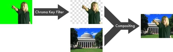
Green Screen by Do Ink
You know what a "green screen" effect is, right? It's used in the movies to make it look like the actors have landed on an alien planet, and it's used on TV to make it look like your local news announcer is standing in front of an animated weather map. Green Screen by Do Ink makes it easy to create green screen videos using your iPad. It emphasizes ease-of-use and simplicity while still enabling you to achieve excellent results.

Check out Green Screen by Do Ink in the App Store! Here's a convenient link to help you find it:
Making Animations and Drawings for Green Screen
Animation & Drawing by Do Ink is great for making videos and images to import into Green Screen. Here's how you do it:
To make a video (or image) for Green Screen, you'll need to make a composition or drawing that has a solid-colored background – green, for example. After you import the video into Green Screen, you'll set the "chroma color" to match the background color of your video. Then, Green Screen will automatically "erase" any portions of the video that contain the background color, allowing other images behind the video to show through. To put it another way, the portions of your video that contain the background color become transparent. The process looks like this:
To set a background color for your video, open the properties panel by tapping the button on the upper toolbar of the composition editor or the drawing editor. Tap the background color item to open the color selector. You need to be a bit careful when you select your animation's background color.
- Use a fully saturated color for your background - i.e., bright colors like green, red, blue, yellow, orange, or magenta. Don't use muted colors, and don't use white, black, or gray. One way to ensure this is to switch to the HSB tool in the color selector, then set the "S" (saturation) and "B" (brightness) values to 100%. After that, you can use the "H" (hue) slider to select a color.
- Choose a color that's different from any of the colors used in the animation itself. Remember, Green Screen will erase everything that uses the background color, so if you choose a color that's used by any of the elements in your animation, those elements will be erased too! For the best results, try to pick a color that's as "far away" from the colors used in your animation as possible.
Getting Help & Reporting Bugs
If you have questions, comments, or suggestions – or, if you've spotted a bug in the app – please let us know. Email us at moc.kniod@troppus. We'll do our best to help!